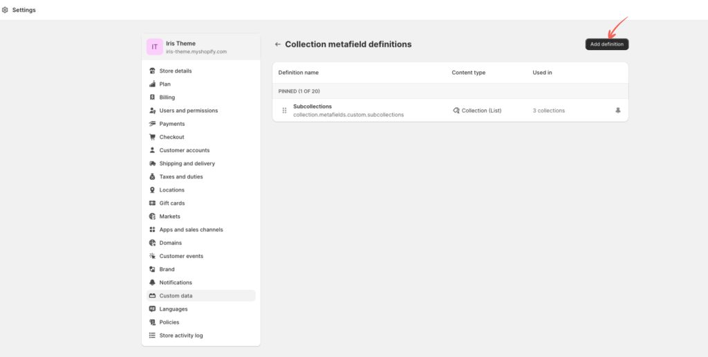
Subcollection feature is set up using Metafields and the dedicated Subcollections section. So, the first thing we need to do is create a new collections metafield.
To do that head to “Settings->Custom data”. In the metafield section select “Collections” and in the new window click “Add definition”.
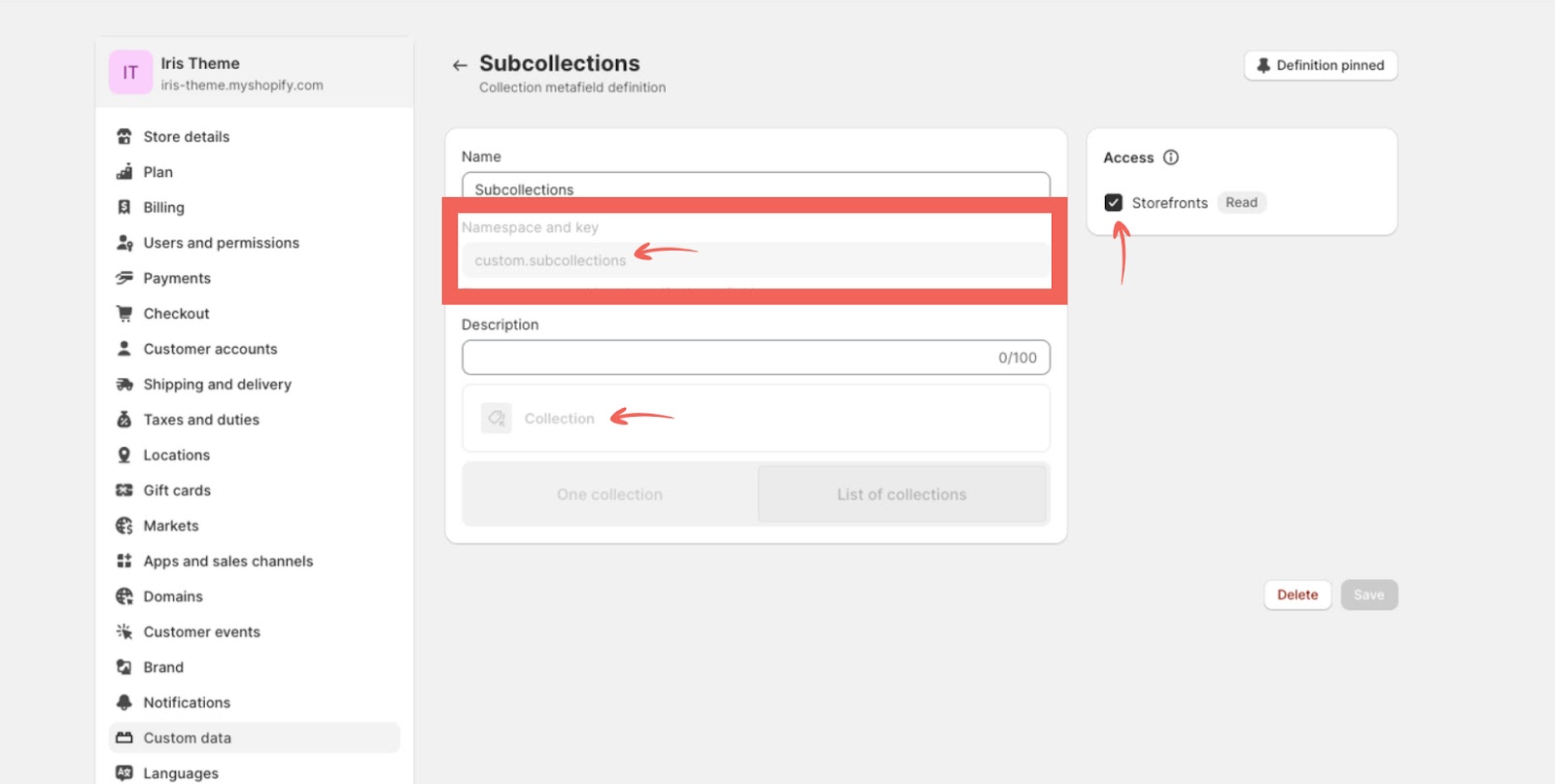
You can name the metafield “Subcollections” or something else, but it is important that the namespace and key filed is set to: “custom.subcollections”.
In “Select type” select “Collection” and then select “List of Collections”. Check the “Storefronts” checkbox in the sidebar and save the definition.
Once you have your definition set go to “Products->Collections” select one of your collections and scroll down to the “Metafields” section. There you should now see “Subcollections” metafield you created.
By simply clicking on it you’ll be able to select collections you want to add as a subcollection for that collection. You can do that for all collections that you want to have a subcollections displayed on their collection pages.
The last step is to go to your Theme Editor and from the template drop-down select the “Collections” and then the “Default Collection” template. Now you can add the “Subcollection” section and set it up the way you want. It will now automatically display subscollections on every collection page that has subcollections set in the metafield.
2.2 Color Swatches
You can use color swatches to replace the default variant color pills with color names and make the color variant options selection for your products more interesting.
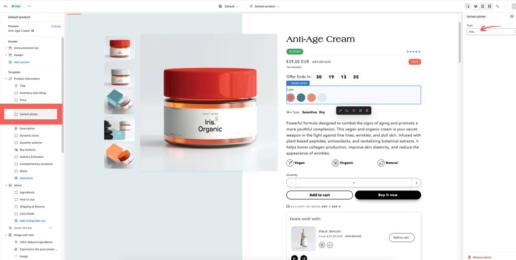
Note: for color swatches to work make sure that the “Pills” option is selected in the “Variant Picker” block. It won’t work with the “Dropdown” option selected.
Color swatches are easily set in “Theme Settings->Color Swatches”.
Before you tick the “Enable Color Swatches” checkbox make sure to set up all the colors you use for your product variants in the “Colors” text area.
You can add one color per row and you need to use this format: Color: #hexvalue, i.e. for black color it would be: Black: #000000. You can find color HEX values here.
You can also add an image instead of a color. This can come in handy when your product features a pattern. Make sure that you have your image(s) uploaded to the “Content->Files” section in your Shopify admin.
In this case, instead of the color HEX value you would add a handle ( name ) and the extension of your image i.e. pattern.png. The format needs to be the same as for colors: Color: image.png. You can also use “jpg” images but make sure to enter that extension.
2.3 Product Card Badges
Iris theme has an option to have two product badges on a product card at the same time.
You can also position them in different corners of a product image.
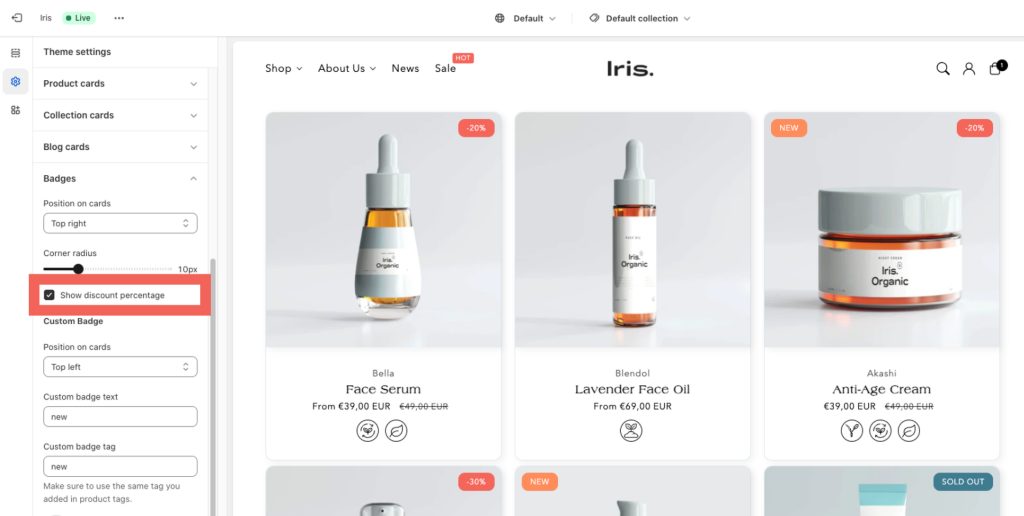
One badge will dynamically show sale badge if you set a discount for the product or a sold out badge if the product is not available. For the sale badge you can choose to show “discount percentage” instead of standard “sale” text by ticking the “Show discount percentage” checkbox in “Theme Settings->Badges”.
For the second badge you need to use a product tag. For example, you want to show a “New” badge on the products you recently added to your store. You’d add a tag ( e.g. new ) in the product tag field of each of the products. Then in “Theme Settings->Badges” add the same tag in the “Custom badge tag” field. Now you can add the text for your badge in the “Custom Badge Text” field. Once set, every product that has that tag you set will now automatically display the badge.
You can also style your custom badge by using text and background color options.
2.4 Delivery Estimator
Delivery estimator is a useful tool to show your visitors approximation of when a product would be delivered if they purchase today. For many customers this is an important factor for making a purchase and can therefore improve your store’s conversion.
It is available as a block on the product page which lets you position it anywhere you want on a product page.
To set it up you simply need to add the minimum and maximum number of business days required for the product to arrive. For example; if you know that it takes at least 2 business days to deliver your products but not more than 5 you would simply add number 2 in the “min” field and 5 in the max field. Estimator will calculate the dates on the fly and your site’s visitors will see the date range in which their product should arrive.
Note: estimator doesn’t count Saturday and Sundays as business days.
You can use delivery estimator in two ways:
Globally – when you first set it up, as described above, it will apply to all products
Per product – you can also set different delivery times for different products by using these product tags: “earliest delivery x” and “latest delivery y”. Replace X and Y with the min and max number of business days required for that product to be delivered.
When a product has these tags added in its tag field it will override the global settings and calculate delivery dates using the numbers added in tags.
2.5 Dynamic Icons With Text
This neat little feature can be used in various ways to display icons and text dynamically on a product page and on the product card. In the demo we used it for product icons ( organic, vegan, natural, etc. ) and the skin type. You can use it to add various product properties that vary between products.
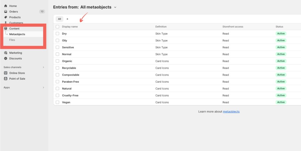
This feature uses Metaobject to achieve this and so the first thing we’ll do is create a metaobject. Head on to “Settings->Custom data->Metaobjects” and click “Add definition”.
Name your Metaobject and then add these two fields:
“Single line text”, name it “title” and select “One value”
“File” name it “image” and select “One file”
It is important that you use “title” and “image” as names.
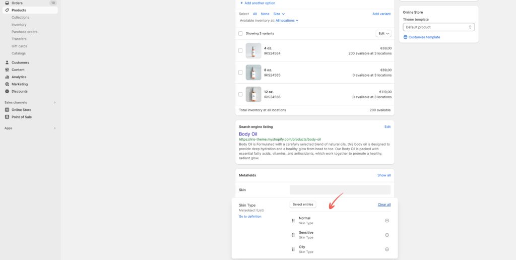
Now you have a Metaobject and we need a metafield to be able to reference that metaobject. In “Settings->Custom data” select “Products” and then “Add definition”. You can name the metafield how you want but make sure that the “Namespace and key” field looks like this: “custom.metafield_key”. You’ll need that metafield key a bit later.
Now that you created a Metaobject and a Metafield go to “Content->Metaobjects” and start adding entries to it. Each entry consist of a title and image. Depending on what you want to display you can add both or just one of these.
When you added the values go to your Products and in the product metafield section you’ll find the metafield you created. For each product you can now add entries that fit the product.
The content of your metaobject can be displayed in two ways:
Product page:
On a product page there is a “Dynamic Icons with text” block. In that block you need to add the “Metafield Key”. You can also add the text that will appear before or above the metafield content depending on the layout setting.
Once you added the metafield key the metaobject entry will display for every product that have them assigned.
This block can be used more than once to display various data related to your products
Product Card ( Collections ):
In Theme Settings go to “Product Card” and add the metafield key.
2.6 Location Map
Locations map is a theme section that displays a Google map to which you can add the location of your company’s HQ as well as other contact details to enable your customers to easily get in contact with you. This is shown to improve customers’ trust in a company.
Once you have the key you can add it in the “Location Map->Google Maps API key” field and the map will show up in your section. Then add your address, set the zoom level and you’re done.
Optionally you can add marker content ( displays on click ), the section title, caption and text. You can also choose between a few section layout options.
2.7 Mega Menu Promotions
Mega menu promotions is a block available in the Header section. It enables you to add a nice promo block to your mega menus.
To make use of it you first need to have at least one menu created in your “Online Store->Navigation”. Then in the “Theme Customizer” in the “Header” section you select that menu to be your “Menu” and in the “Header->Desktop Menu Type” drop-down select “Mega Menu”.
Once you did that all your navigation menu items that have at least one 2nd level submenu will be converted into a mega menu. For these navigation menu items you’ll be able to add promotion blocks.
To do that add the “Mega Promotion” block to the header and in the “Menu Item” field enter the name of the menu item to which you want to add the promotion. Please note that this is case sensitive and the names have to match perfectly.
Now you can add an image, title, subheading and a link to where you want your promotion block to link to.
2.8 Advanced product filtering
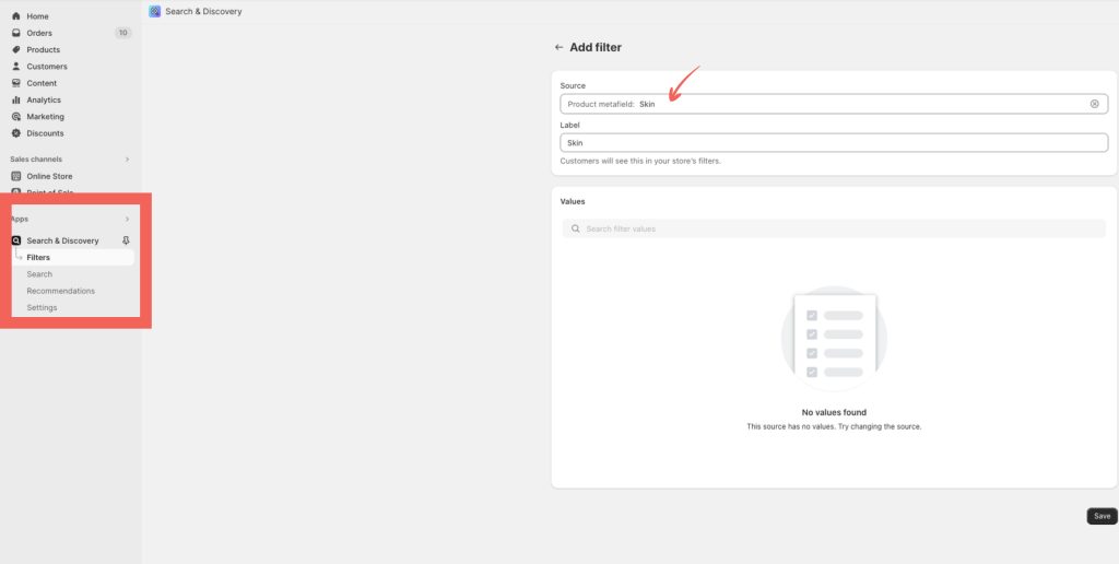
Iris theme supports advanced product filtering which requires the official Shopify Search and Discovery App to be installed. Once you install the app make sure to get familiar with it as it offers quite a few nifty features you can use in your store.
Once you installed the app head on to “Apps” in your Shopify admin and select “Search and Discovery”. From the “Features” select “Customize Filters” option and click “Add Filter”. Now click the search field and you’ll be presented with a list of filters currently applicable to your products that you can add to your filter.
One cool thing you can do is filter your products by metafields. This enables you to create search filters even better dialed in for filtering specific properties of your products.
For example you can create a metafiled named “Skin” and then have a filter that could filter by various skin types i.e. dry skin, oily skin, mixed, etc.
To set up that option you go to “Settings->Custom data”, click “Products” and then “Add definition”. You can name your metafiled “Skin” and then in “Select Type” select the “Single Line text” and save.
Now you go to Products in your Shopify admin and for each product you want to include in that filter you add a skin type in the “Skin” metafiled at the bottom of the product editor.
In the end you go back to the “Search and Discovery” app and add the “Skin” filter.
2.9 Complementary and related products
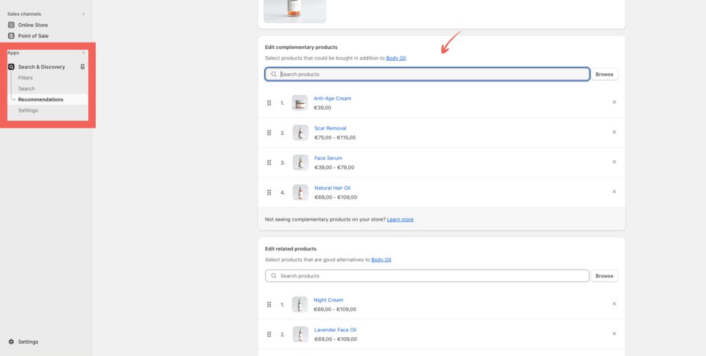
With the complementary products feature you can dynamically show complementary products on your product page. This increases the chance for customers to find and purchase additional products related to what they’re already interested in.
This also requires the official Shopify Search and Discovery App to be installed. If you already installed that app to set up advanced filtering then you’re ready to go. If not you’ll have to do it now.
Once installed go to “Apps” in your Shopify admin and select “Search and Discovery”. Select “Recommendations” and from the list of products select a product to which you wish to add complementary products. You can set that for all your products or just some of them.
Now you just need to go to the Theme Customizer, select the product template and add the “Complementary Products” block to it. In the block settings you can also set the number of products you want to show as well as the heading.
The Related Products feature works in the same way. The difference is that even if you don’t set related products it will automatically try to show the products that are reated. You can disable this per product by ticking the “Hide auto-generated recommendations” checkbox.
To add Related Products to your product page in the Theme Customizer select the product template and then add the “Related Products” section.
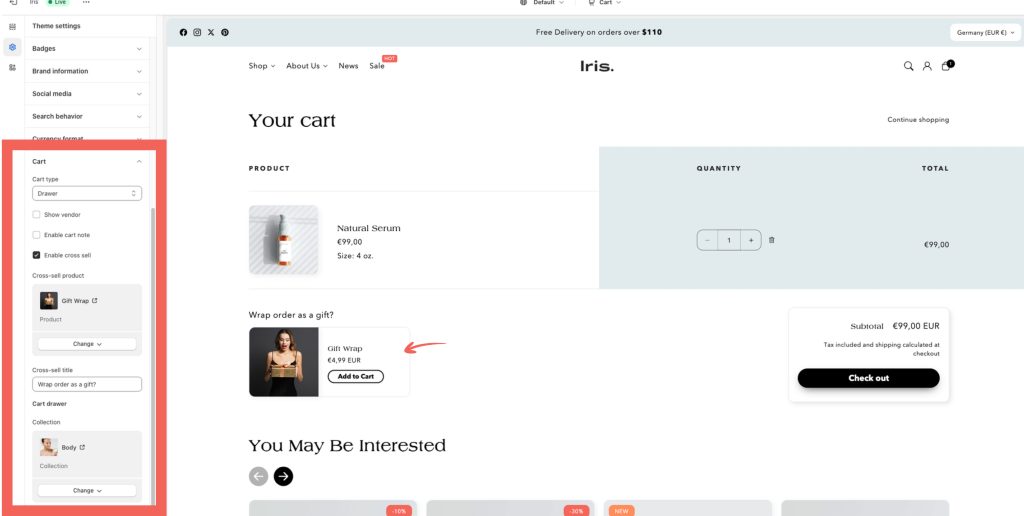
2.10 Cart cross-sell product / gift wrap
With Iris theme you get an option to offer a specific product directly in the shopping cart.
You can use this to cross-sell a product or even a service that might be valuable to your audience regardless of what they purchase. It could be a t-shirt with your brand logo or a gift wrapping.
To set it up head on to “Theme Settings->Cart”. Enable cross-sell feature and select the product you want to display. You can also add a heading to encourage an action.
In case of a gift wrap product or certain other cross-sell products you may not want to have the product displayed on your product listing and collections. To hide any product you can use the “hide-product” tag.
2.11 Recently Viewed Products
Having a way for potential customers to quickly come back to products they recently viewed is a great way to boost conversions. You’re essentially showing them products that they already showed interest in but haven’t purchased right away thus giving them an easy way to get back and purchase when they are ready.
This feature comes as a standard theme section that can be added to any page including product and collection pages. There are a few quick settings you can adjust and then simply let it do its thing.
When you first add the section you won’t see anything on the front. However, as soon as you visit any product’s page, the section will display and will list the product you viewed.
2.12 Waiting List / Item Out of Stock
If one of your products or a variant of a product is out of stock having a waiting list is a good way to stay in touch with a potential customer and remind them to purchase when the product is out of stock.
This feature is a block that can be added to a product page within the Product Information section. The block becomes visible to the customer as soon as a product or a variant is out of stock. An email will be sent to your Shopify address when a user enters their details and clicks the button.
You can easily customize the title, tagline, and button text that appears on the page as well as the notice that appears after someone subscribes to the list.
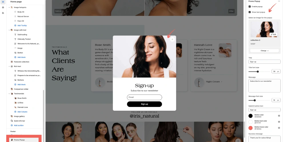
2.13 Promo Popup
Nudge potential customers to subscribe to your newsletter with a beautiful-looking popup. This feature is available site-wide and you can find it within the Footer section.
Add it by clicking the “Add Section” in the Footer and then customize it to fit your brand. You can also enable the testing version of the popup to make it visible in the customizer while you’re working on it.
You can, of course, add your title and message, adjust the size, customize the button color, and set how many times the popup will appear and the time before the popup appears.
2.14 Show product variants in collections
By default, in Shopify collections, you can only display the main products and not their variants. With the Iris theme, you can easily show Color and Size variants by simply ticking the checkbox.
Open your theme customizer, select a collection template, and then select the Product Grid section. Within that section find the Product Card > Show product variants in the collection checkbox to enable this feature.
Important: make sure that all your product variants have their images set. Otherwise, the product card will be displayed with a white background instead of an image.
2.15 Video Background
The Video Background section allows you to set textual content and a button on a video background. This is a good way to attract attention to a piece of important content on your page and then use the button to link to a dedicated page.
This section is available site-wide and comes with a set of options that enable you to customize this section to fit the rest of your site.
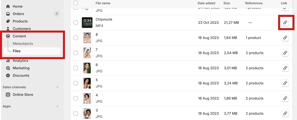
Upload Video
To set a video background you first need to upload your video to your Shopify store via “Content->Files”. Once uploaded, click the link icon to copy the link and paste it into the video URL field.
Now you can, if needed, add a caption with text and button to the video and style it how you want.
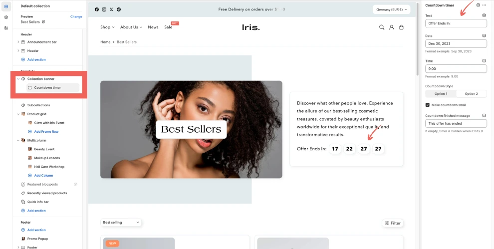
2.16 Countdown Timer
Create a sense of urgency ( FOMO ) with Iris’ countdown timer feature. This feature is available as a block in these sections:
Featured Product
Featured Collections
Image Banner
Info/social (announcement) bar ( in the header )
Collection banner ( on the collection page )
Product information ( on the product page )
When setting up the timer make sure to use the date and time format shown within the block.
Important: universal time UTC is used for time calculations. Pay attention to the counter when setting the end time. Tip: use Time Zone Converter to convert your local time to UTC.
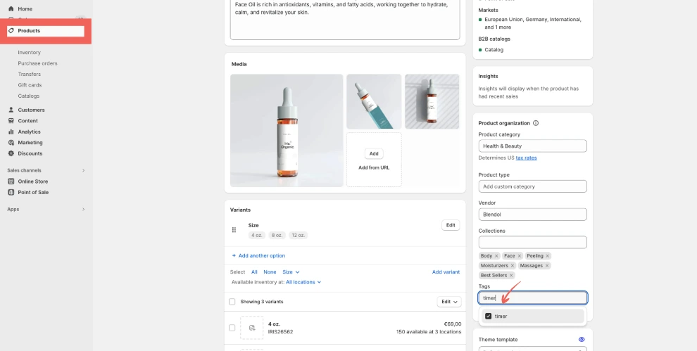
On the product page, you can find it as a block in the Product Information section. Here it can be set to display on all products or only on products with the “timer” tag. This is controlled by the checkbox at the bottom of the countdown timer options.
If you decide to display it only on products with the “timer” tag make sure that you add the tag in the Tags box for every product you want it to appear on.
On collection pages, the timer is available in the Collection Banner section.
2.17 Header and Navigation Menu
With the Iris theme,you have a choice between astandard drop-down style menu, a drawer-style menu, and a mega menu. There are also various options for the header layout.
Before you start playing with various options you need to set up your first navigation menu. To do that head to Online Store ->Navigation in your store’s dashboard. To set up your first menu you need at least a few pages, products, or collections. Once you have these ready you can start adding them to your navigation menu.
Please check Shopify’s navigation menu guide to learn how to add/remove/edit items in your navigation menu.
Assign the menu
Now that you have your navigation menu ready head to the Theme Customizer > Header.
At the top, you have the Menu section where you can select the menu you created to display in your header.
When you assign your menu you can start customizing its appearance by choosing the color scheme, layout, and type.
Mega Menu
Mega menu is often the preferred option for online stores with a large inventory and a lot of collections. To switch to the mega menu go to Theme Customizer > Header and from the Desktop menu type select Mega Menu.
By default, when you select the mega menu option only menu items with 3 levels ( 2 submenu levels ) will be turned into a mega menu. The rest will be displayed as a standard drop-down menu.
To turn all menu items into mega menu style make sure to tick the Apply mega menu to all menu items checkbox. For the mega menu, you can also choose between three animation options.
Highlight a menu item
If you want to highlight a top-level menu item you can do so by adding a colored badge with text to it. First, enable highlight by ticking the Enable menu item highlight checkbox and then set the text and color for the badge.
Use the Menu item highlight position drop-down to assign the badge to the menu item you want.
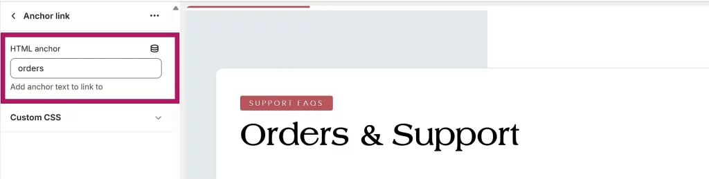
2.18 Create an Anchor Link
With the Iris theme, you can easily create HTML anchors anywhere on a page and link directly to them from the navigation menu or any other link or button.
To add an anchor point to a certain position on a page you need to use the “Anchor Link” section. Add it above the section where you want to link to. Once you added the section, add a word you want to use as an anchor in the HTML anchor text field.
Now you can add a link to your anchor point to any linkable element by adding the #anchor ( anchor being your anchor word ) to the link of the URL of the page where the anchor is added. For example: https://yourstore.com/about/#anchor
2.19 Display swatches and images in the collection filter
By default, the filter on collection pages can be set to display the names of the colors without actually showing the color. To display swatches and images in the filter you first need to install the “Search and Discovery” app from your Shopify dashboard Apps section.
Once you have the app installed you need to create a metaobject. If you haven’t worked with metaobjects yet please check the references here.
Creating a metaobject
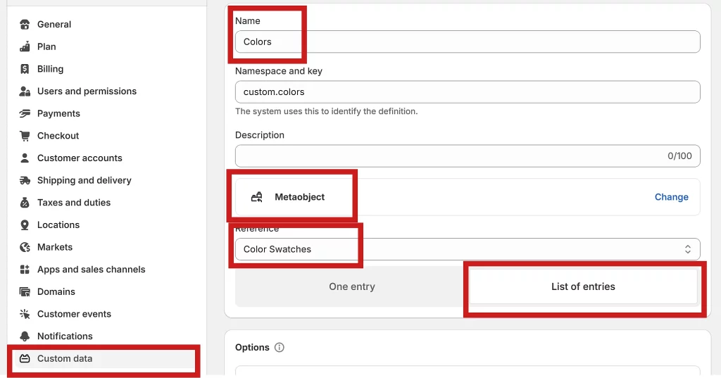
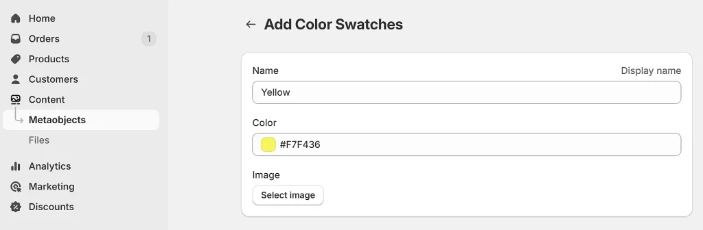
In your Shopify dashboard head to “Settings->Custom data->Metaobjects definitions” and click “Add definition”. Name the metaobject, e.g. “ColorSwatches“.
Now add the first field. It will hold the name of the color, so click “Add field”, select “Single line text” and name it “Name“. The next field will hold color. For that purpose select “Color” and name it “Color“. The last field will have images. For that purpose select “File” and name it “Image“.
Once you have these set, save the metaobject.
Create a metafield
Now that we have a metaobject we need to create a metafield to reference that object. Head to “Settings->Custom data->Metafields->Products” and click “add definition”. Name the metafield, e.g. “Colors“.
As a “type” select “Metaobject” in the “reference” section and then from the drop-down the metaobject you created ( e.g. Color Swatches ). At last select “List of entries” option and save the metafield.
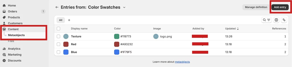
Add Colors to the metaobject
Now you can add colors by going to “Content->Metaobject“. Select your metaobject and click “add entry”. Each entry accepts “name”, “color” and “image”. If you need just a solid color add “color” value and the name. If your product would be better presented with a pattern, add an image showing that pattern.
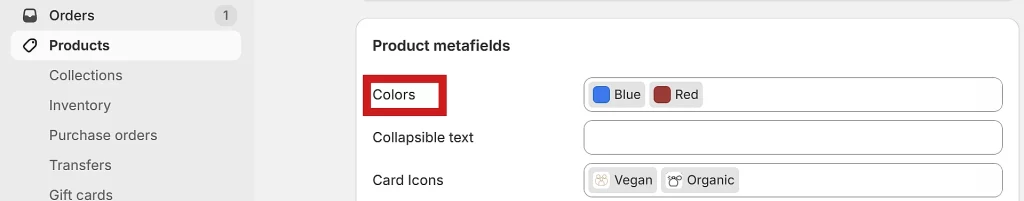
The colors/images you added to the metaobject can now be assigned to products from the product’s metafield section. Go to one of your products scroll to “Product metafields” and click on the metafield you created ( e.g. Colors ). Select the colors that apply to that product.
You can also create new metaobject entries ( add new colors ) directly from there by clicking “add new entry“.
Show color swatches in the filter
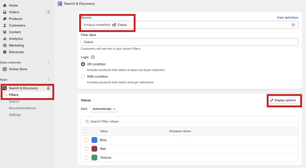
Now that we set up all the colors and assign them to products we need to display them in the filter. To do that in your Shopify dashboard go to “Apps->Search and Discovery ->Filters” and click “add filter“.
Click inside the “Source” field and then from the list select the product metafield you created for this purpose ( e.g. Colors ). You will see all the color values listed under “values”.
Now go to “Display options“. As we created this metafield to display color options select “Swatch“. If your products only feature solid colors you can just set “Swatch color” to “Color”. If some of your products use images to show patterns then set “Swatch pattern” to “image” otherwise you can set it to “none”.
Save the filter. Color options should now be displayed in your collection page filter.
Other uses for this feature
Besides displaying the nice color swatches you can use equally well use the same process to create a filter that would display for example various shapes, types, or even brand logos.
The setup process would be roughly the same. You’d create a metaobject that would have “Single line text” for the name and a “File” field. Color wouldn’t be needed here. Then create a metafield to reference that metaobject. Keep in mind that the name of the metafield is the name of the filter that would appear on your collection page.
In the end, you’d set Search and Discovery app to show “Image” instead of “Swatch”.
3. Iris Theme Settings
3.1 Typography
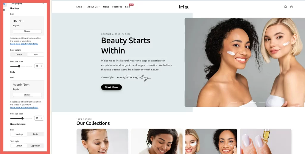
You have complete creative control over the typography of your store. You have the option to choose a specific font for your headings and another font for other typographic elements, such as body text. It’s worth considering that adhering to best practices involves opting for no more than two font families and making a thoughtful selection between them.
Headings:
Font: select your font for headings
Font Weight: choose between “Default” and “Bold”. Some fonts don’t offer these options. In such cases, this setting will not have any effect.
Font Size Scale: you can begin at 50% and gracefully scale up the size of headings to a maximum of 130%.
Body:
Font: select your font for body text.
Font Size Scale: you can enhance the size from 50% to a maximum of 130%.
Navigation:
Font: choose between the Headings and Body font.
Text Style: choose between the “Default” and “Uppercase” styles.
Main Menu Font Scale: adjust the main menu font size.
Submenu Font Scale: adjust the submenu font size.
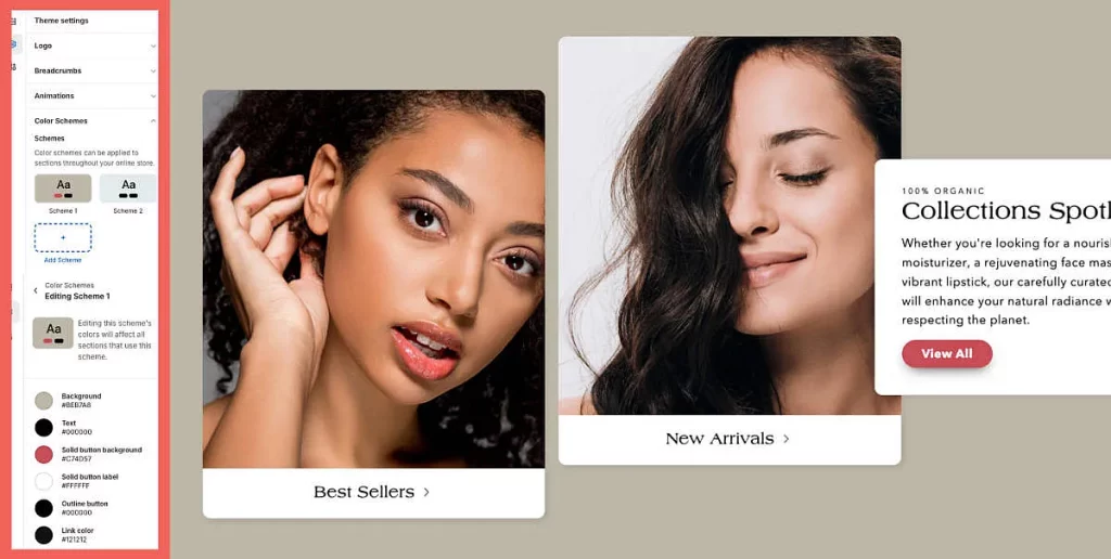
3.2 Colors
Customize colors for your entire store. Iris theme has color options split into two sections, Color Schemes and Additional Colors.
Color Schemes
In color schemes, you can set up main colors like background, text, button, and link colors. Once you set up your color schemes in Theme Settings they need to be applied per section using the Color Scheme setting within section settings. This way you can use different color schemes for different sections.
Our Tip: use Scheme 1 as your default color scheme and then use other schemes for sections where you want to have different backgrounds, text, or button colors. If you just want to have, for example, a different background color make sure to set the other colors in that scheme to the same values as in your default scheme.
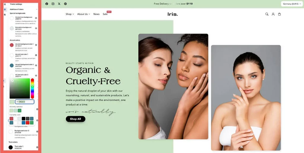
Additional Colors
In the additional colors section of the Theme Settings, you can adjust colors used for various elements like badges, special buttons, decoration backgrounds, borders, and more. These color settings are outside of the color schemes and are applied globally.
Accent color options are used for various badges and the countdown timer. Special background options apply background colors to various elements found in many sections e.g. content boxes, decoration background, and more. The quick add button colors can be adjusted independently of the standard buttons which are set in the color scheme. There are also options to adjust opacity and border colors which are used in a few sections.
3.3 Layout
Here, you have the ability to fine-tune the page width for your entire store, make adjustments to the spacing between template sections, and even refine the grid layout, both horizontally and vertically, for your entire store.
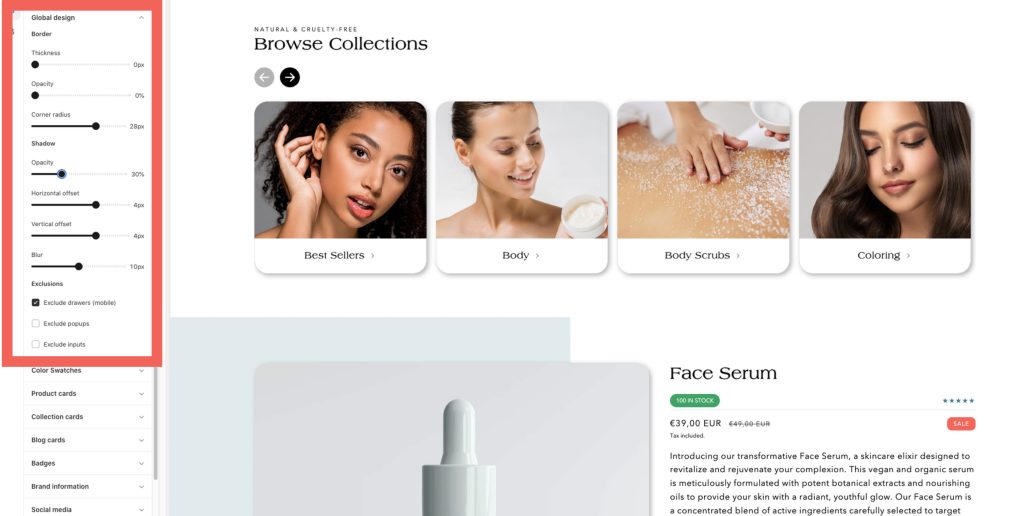
3.4 Global design
Here, you have the choice to make global modifications to the borders and shadows of elements throughout your entire store.
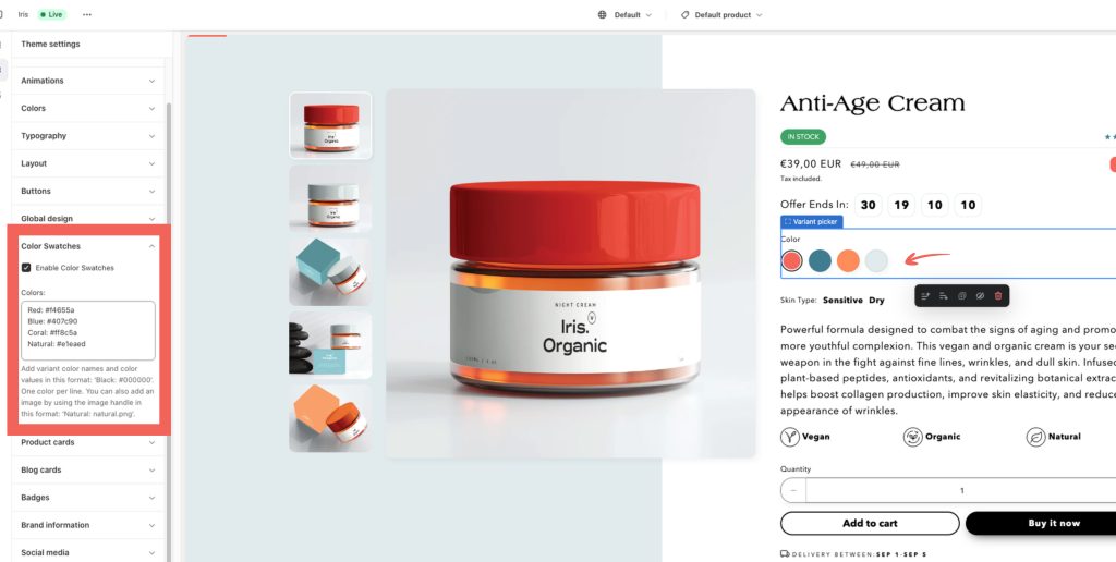
3.5 Color Swatches
Swatches provide an excellent solution for utilization with product pages, product cards, and search filters. If customers are seeking a specific color, material, or texture for a product, swatches significantly enhance their ability to visually identify the desired choice while also exploring other potentially appealing options. To learn about its functionality and setup instructions, please refer to this link.
3.6 Badges
Iris theme has an option to have two product badges on a product card at the same time.
You can also position them in different corners of a product image, change the radius and colors. For further information, check this link.
3.7 Brand Information
Enhance your store’s footer by incorporating a brand description and image. Start by completing the headline, description, and image upload. Afterward, add a “Brand Information” block into your footer.
3.8 Social media
The social media options below are at your disposal:
– Facebook
– Instagram
– LinkedIn
– Pinterest
– Snapchat
– TikTok
– Tumblr
– Twitter
– Vimeo
– YouTube
Just input your URLs and head to the Footer or Announcement bar section to display them. You can achieve this by activating the “Show social media icons” option.
3.9 Cart
Here, you can choose the cart type for your store. Additionally, you can enable cart notes and introduce complementary products, like gift wrapping, to further enrich the cart functionality.
4. Metafields and Metaobjects
The stored information can then either be displayed on, for instance, product or collection pages or can be used for internal tracking.
In the context of a theme and your store’s design one of the most obvious ways to use metafields is to show product-specific information on your product page.
To learn more about metafields and metaobjects please check these resources: metafields, metaobjects.
Once you created metafield definitions you can easily connect them to the theme and display them on your store directly from the theme editor. Theme sections and blocks that support dynamic sources feature the dynamic source icon:
In the Iris theme, you can display dynamic sources in a variety of sections and blocks on product and collection pages.
Creating dynamic icons and subcollections are two unique and interesting ways to use metafields and metaobjects. Please check the related guides below:
4.1 Use Metafields With Sections and Blocks on Product Pages
One of the most practical methods of using metafields is adding product-specific content on the product pages. By default on a product page, there’s only a “Description” box where you can add textual content that will be dynamically displayed on a product page. With metafields you can create as many additional content boxes as needed and connect them with any section or block to be displayed dynamically on the product page.
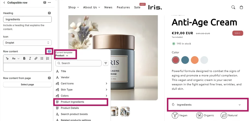
In this guide, we’ll be creating a text metafield and connecting it to a “Collapsible row” block. Let’s go!
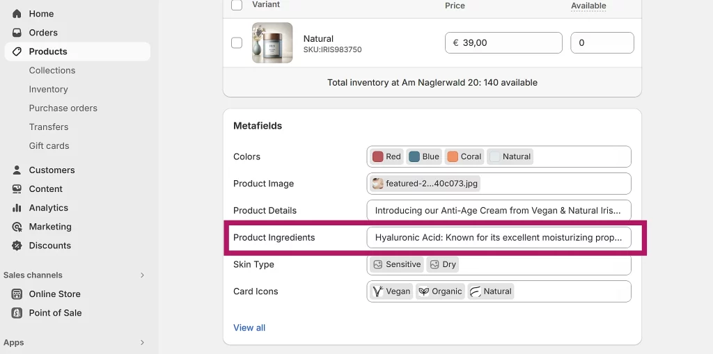
Create a text metafield
In your Shopify dashboard go to “Settings->Custom data->Products“. Click “add definition” and give it a unique name. For example: if you want to use this metafield to store your products’ ingredients then you can name it “Product Ingredients”.
Now click “Select type“, then select “Rich text” or “Multi-line text” and save it. This metafield will now be available in the Metafield section of each product ( below Variants ). You can now add unique text content for each of your products.
Display metafield content
Once you created a metafield and added content for at least one of the products you can connect a metafield to a Collapsible row content box or any other section or block ( that has a text/content box ) on the product page.
To do that click the dynamic source icon above the content box, set “current template” to “product“, and then, from the list select the metafield you want to add.
The content will now be pulled dynamically from that metafield and each product will display content you added to its metafield.
In most cases, you’ll want the heading of the collapsible row to be the same for all products, i.e. Product Ingredients. You would then add the heading directly to the heading text field in the block.
However, if you require headings to also change dynamically then you can create a metafield as described above and assign it to the heading text field. In this case, as a “type” of metafield you’d want to select “Single line text” instead of the “Multi-line” or “Rich text”.
5. Iris Page Templates
In the theme editor, you can discover which templates are applied to which pages, and then edit them to customize the information displayed to your customers.
It is worth mentioning that editing a template applies the changes to every page that uses that same page template. You can easily create templates yourself (up to 1000) and use available sections and blocks to create layouts that best fit your brand.
Iris comes with a set of templates for the main pages in your store to get you started quickly and easily. Page templates like “default”, “about”, “contact”, “faq” or “lookbook” can be used on any page on your site. You can customize them, duplicate them to create different versions, and so on.
Dynamic templates like “product”, “collection” and “blog” you can only use for the intended purpose of displaying your collection, product, or blog page.
There are also specialized templates like “404”, “gift card”, “cart”, “search” and more that let you customize the look and feel of these pages.
Important: templates can be applied to pages only when the theme is published.
6. Image Sizes
These are the sizes of the images used in the Iris theme demo. Image sizes are not set in stone and different sizes can also be used successfully. These values can be used as an orientation and a starting point.


3.8 Social media
The social media options below are at your disposal:
– Facebook
– Instagram
– LinkedIn
– Pinterest
– Snapchat
– TikTok
– Tumblr
– Twitter
– Vimeo
– YouTube
Just input your URLs and head to the Footer or Announcement bar section to display them. You can achieve this by activating the “Show social media icons” option.